
Comic Coloring
- Ike Crawford
- Feb 23, 2024
- 4 min read

I’m not about to give you a run down of color theory so I’m going to skip, jump, and blunder my way to a brief and pointed look at the colors on my latest book, that I was 10 pages into when I made the decision to rework them.
Disclaimer: I'm still learning about coloring. My approach into it was a necessity, to make my comics; my interest, beyond storytelling, was in inking and drawing; but, I have experimented and learned a few things. I think my approach is untechnical and unconventional, to put it nicely, but the way I think about coloring could be useful to some.
For my first attempt at the pages, I was looking to go from the monochromatic colors of episode one, to a palette that was still heavily warm yellows, but more tetradic, with a warm yellow spreading to a burnt orange, and a teal for contrast/accents.


After getting several pages in, I felt that the color range was too narrow (every page gold...eek!) and that, more importantly, there wasn’t enough variation in value (light to dark) to create as much depth and lighting/highlights as I would prefer. I’ve converted both the old colors (left) and the new colors (right) to grayscale, so that you can see the value more directly. Notice that the new colors, even when reduced to grayscale, have more contrast and variation, and more effectively separate the fore-, mid-, and background elements.


It might be useful to note that I allowed my colors reach to a darker low end value than I usually do. I know I need to be careful with that, so that, when it comes time to print, it isn’t too dark (either making the page seem dark and hard to see clearly, or making the inks seem to disappear in the dark colors next to them). I’ll save that topic for another time, but the important point is that I made sure to include a range of light and dark values and that helps protect it from being "too dark".
When it comes to choosing colors, notice that, when the values are done well, it works with almost any colors… (on the left is the old version with randomly converted hues, and on the right is the new version).


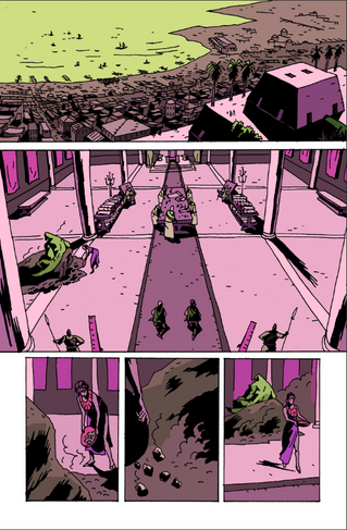
And here are the final pages, in color. You could say that the yellows are toned down and the red-oranges are used sparingly, rather than as transitionary between the yellows and the blue-greens.


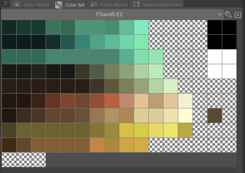
How did I select my colors? I thought of it this way: a bright, warm color (yellow) for highly lit, brighter things, and a dark, cool color for darker things. Think of it as reflected light off of objects rather than their local color, in and of themselves. Then I chose a range of yellow to red for a set of warm colors and a tighter range of blue-greens for the cooler colors that can be used to highlight, separate, and represent all the colors of things in the world (red, yellow, blue and we have the whole world covered). Lastly, I selected a set of skin tones (that will also appear in the world in other ways, too) that fit in with the warm colors I chose, with slight pinks, slight browns, and such. In the original palette I avoided browns, going for orange or yellow or green, but I embraced them in the new palette. In the end I had a pretty earthy palette, and I went with it. It could have been any other palette, but I tried it on and it felt right. The earthy and warm feel of the colors seems to suit the setting, the time and place.
I started by blending the colors together like this to see how it looked (left) and then created a board for them (right), lining them up by value and making sure I had a good range for all the colors.


I should also mention that, beyond a range of values and a range of colors, you are also looking for a good balance--and that means an uneven balance! Think of it like the golden ratio rather than a balanced scale. Also, I think of it like having a dominant color, a secondary one, and an accent one. I can select different colors for each of these positions in the hierarchy for each scene, to create variation using the same palette, and even then there will be particular arrangement that occurs more dominantly, more often in the book, and another secondarily, and so on. Notice that in my first attempt at the pages the colors are more literally balanced (not following a golden ratio) and the dominant color is the same between the two scenes rather than changing for variation (the first two example pages are from the first scene and the third example is from the third scene).
So, the changes I've made are an improvement, right? Everyone I've shown seems to think so. Do I know for sure what I'm doing? Kind of, maybe. The flat colors I’m using now are about as minimal as it gets, without going to monochromatic (and I'm all for minimal...and fast). Technically a two-tone palette would be a great option and could be blended with digital brushes, opacity, and layer settings, but I wanted to go broader than that, since that is almost the same as a monochromatic representation in that it has almost nothing to do with the local, actual color of things and is more about lighting and value. I can still see that what I came up with is limited in terms of cool to warm contrast (everything is pretty warm and is only cool by comparison to the even warmer colors) but remember that the last issue was purely monochromatic, so this is a big step up in complexity as it is. But still, for example, how would I color a nighttime scene with this warm palette? When that time comes, I’m going to have to add to this palette, pulling from the cooler or warmer colors, adding a new bridge to the chorus or maybe even a key change, to use music metaphors.
So that is my thought process on changing the colors like I did. Hope you gained something from reading about it!

Comments